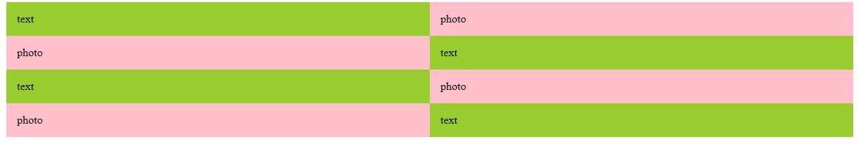
定義

  • ::before 原本的元素[之前]加 入內容
  • ::after 原本的元素[之後]加 入內容

使用方式

  • 使用時,需要加上content 才能使用
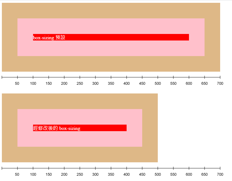
  • 產生出來虛擬元素為inline特性。無法控制寬、高、行距
  • 有關SEO內容,不應該放在content內
  • content:搜尋引擎找不倒裡面的文字
  • 可以減少HTML標籤數量,相對也加重瀏覽器的渲染區塊

偽元素

1
2
3
4
5
6
7
8
9
10
11
12
13
14
15
16
17
18
19
20
21
@charset "UTF-8";

.box {
background-color: yellowgreen;
width: 500px;
padding: 15px;
margin-left: auto;
margin-right: auto;
}

.box::before {
content: "我是 before";
background-color: pink;
display: block;
}

.box::after {
content: "我是 after";
background-color: wheat;
display: block;
}

反轉

1
2
3
4
5
6
7
8
9
10
11
12
13
14
15
16
17
18
19
20
21
<body>
<div class="base">
<div class="base-text">text</div>
<div class="base-photo">photo</div>
</div>

<div class="base flip">
<div class="base-text">text</div>
<div class="base-photo">photo</div>
</div>

<div class="base">
<div class="base-text">text</div>
<div class="base-photo">photo</div>
</div>

<div class="base flip">
<div class="base-text">text</div>
<div class="base-photo">photo</div>
</div>
</body>
1
2
3
4
5
6
7
8
9
10
11
12
13
14
15
16
17
18
19
20
21
22
23
24
25
26
27
28
29
30
31
32
33
34
35
36
37
38
39
40
41
42
43
@charset "utf-8";

*,
*::before,
*::after {
box-sizing: border-box;
}

.flip .base-text {
float: right;
}

.flip .base-photo {
float: left;
}

.base {
width: 1200px;
margin-left: auto;
margin-right: auto;
}

.base::after {
content: "";
display: block;
clear: both;
}

.base-text,
.base-photo {
width: 50%;
padding: 15px;
}

.base-text {
float: left;
background-color: yellowgreen;
}

.base-photo {
float: right;
background-color: pink;
}

麵包屑

1
2
3
4
5
6
7
8
9
10
11
12
13
14
15
16
17
18
19
20
21
22
23
24
25
26
27
28
/* @charset "utf-8"; */
/* Base */
* {
box-sizing: border-box;
}

body {
font-family: Arial, Helvetica, "微軟正黑體", sans-serif;
font-size: 15px;
}

.breadcrumb{
margin-top: 20px;
margin-bottom: 20px;
}

.breadcrumb__item a:hover{
color: #2ea3f2;
}

.breadcrumb__item + .breadcrumb__item::before{
content: "»";
margin-right: 3px;
color:#aaa;
}
.breadcrumb__item a{
color: #aaa;
}